During the last week, I have been working on redesigning my site. Here is the list of all changes:
- refreshed design,
- added dark mode,
- updated Disqus configuration,
- updated responsive images, and
- updated headers.
Refreshed design
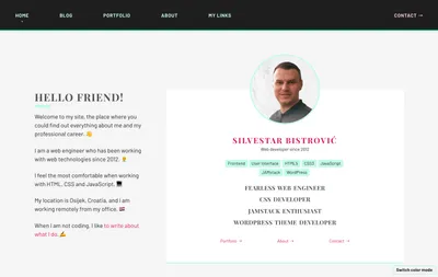
Since I am not a designer, I have started with a couple of prototypes on Codepen:
- Article Card, and
- Profile Card.
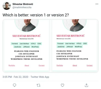
Then I have asked a question about which design is better on Twitter, and most people choose the centred version. I liked that one more, too.
Finally, I have updated HTML and CSS code. I have removed hard-coded sections from the theme, and I used Hexo built-in features.
Added dark mode
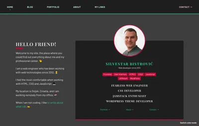
I wanted to add the dark mode to my site, so I introduced CSS Variables to my Scss codebase. I have four major modes:
light-mode,dark-mode,mixed-mode, andcomment-mode.
@mixin light-mode {
 --color-alpha: #12e09f;
 --color-beta: #e01258;
 --color-gamma: #f5f5f5;
 --color-delta: #C2FAE8;
 --color-epsilon: #FAC2D4;
 --color-chi: #4f4f4f;
 --color-psi: #1f1f1f;
 --color-omega: #fff;
}

@mixin dark-mode {
 --color-alpha: #e01258;
 --color-beta: #12e09f;
 --color-gamma: #3e3e3e;
 --color-delta: #C20A38;
 --color-epsilon: #42AE8C;
 --color-chi: #e1e1e1;
 --color-psi: #fff;
 --color-omega: #1f1f1f;
}

@mixin mixed-mode {
 --color-alpha: #12e09f;
 --color-beta: #FAC2D4;
 --color-gamma: #4f4f4f;
 --color-delta: #e01258;
 --color-epsilon: #C2FAE8;
 --color-chi: #fff;
 --color-psi: #1f1f1f;
 --color-omega: #3e3e3e;
}

@mixin comment-mode {
 --color-gamma: #d5d5d5;
 --color-psi: #1f1f1f;
}
The first two are used globally. The third one, mixed-mode, is used for pages with forms, like the Contact page. The last one, comment-mode, is used to style Disqus comments.
Updated Disqus configuration
I published an article about page builders recently, and it gained many responses. I noticed strange behaviour with my Disqus comments: different comments appeared based on different URL parameters. To fix that, I had to use URL Mapper to merge all comments based on the correct URL and set the unique identifier:
this.page.identifier = UNIQUE_PAGE_IDENTIFIERUpdated responsive images
A long time ago, I bookmarked the article “Images Are Not Static Content“. The gist of the article is not to serve only static images to users, but images tailored to the needs and context of the browser and user.
Since I am using Cloudinary service as my “Dynamic Media Platform”, as they like to call it, I decided to take advantage of the platform.
“Because images have such a high impact on website performance, images must be tailored according to the capabilities and context of the browser and user.”
I ditched the hexo-cloudinary package, a Hexo tag plugin I created before, and I developed a new Hexo tag plugin: hexo-cldnry. It uses the Cloudinary Node.js SDK, Cloudinary JavaScript library, and Clients Hints feature for creating the automated responsive images. You could learn more about it on by reading the Responsive Images Guide.
If you need help setting the Hexo plugin, feel free to contact me or open a new issue on GitHub.
Updated headers
To be able to use Client Hints, I had to enable it on Netlify:
Accept-CH: Downlink,RTT,Device-Memory,Save-Data,DPR,WidthEnabling Client Hints helps Cloudinary make better decisions which image to deliver to the end-user. I added Feature Policy headers and now Security Headers tool shows A+ score for my site.
Conclusion
I am quite happy how things turned out. My site is still very performant, which is very important to me.
A personal site redesign is a great way to improve your skillset, but don’t do it too often and without the plan. Here are some of the items from my todo list for the next iteration:
- add Code Line Daily widget on the homepage,
- consider adding a twitter feed, and
- consider investing time in print css.