The World Wide Web Consortium (W3C) published a First Public Working Draft of CSS Anchor Positioning last year, so I thought I would give it a try. I already had a perfect candidate to try it on: a component on my other site, adedicated.dev, which showcase my services by linking different words together.
To link different elements in columns, my component relies on heavy JavaScript calculation. Here's that example.
While I love solving a math problem here and there, I prefer browsers doing these kinds of calculations for me!
Let's take a look at CSS Anchor Positioning and see how it might have a solution for us.
A Bit about CSS Anchor Positioning
CSS Anchor Positioning provides a better way to position an element in relation to another element. Think of a tooltip and how it is positioned related to the element that triggers it. The perfect tooltip usually "knows" if it overflows outside of the containing block. For example, if the tooltip doesn't fit above its trigger element, it should go below it. CSS Anchor Positioning solves this problem for us, and that mean less JavaScript calculation.
It is worth noting that CSS Anchor Positioning is quite new API and it is prone to changes. At the time of this writing, the only browser that supports this feature is Chrome Canary, and it is behind the "Experimental Web Platform Features" flag.
The Demo
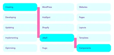
Back to my component. I have a three columns, and in each one I have a set of words which, when linked, form a new term. When you hover over any word, a random word in three different columns is highlighted and the final term is created. For example, "Creating WordPress Websites" or "Developing HubSpot Pages" or "Updating Shopify Layouts". I thought it would be fun to showcase my skills in such a way. Here's how the component works:
To solve the problem of linking different words, we need to prepare the HTML for that. I am using two <div>s for two links, first one for link between first and second column, and the other one for linking second and third column.
<div class="link link--alpha"></div>
<div class="link link--beta"></div>
First thing we need to do is to position our <div>s. For each level links, I had to set up the min-block-size (the logical equivalent of width in a left-to-right or right-to-left language --- we'll be using more of these logical properties as this article goes on):
.link {
  position: absolute;
  min-block-size: 2px;
}
Then we need a grid of all words. I am using unordered list and CSS Grid to achieve this.
<ul>
  <li>Creating</li>
  <li>WordPress</li>
  <li>Websites</li>

  <li>Developing</li>
  <li>HubSpot</li>
  <li>Pages</li>

  <li>Updating</li>
  <li>Shopify</li>
  <li>Layouts</li>

  <li>Implementing</li>
  <li>Jekyll</li>
  <li>Templates</li>

  <li>Optimizing</li>
  <li>Hugo</li>
  <li>Components</li>
</ul>
:root {
--color-alpha: lightcyan;
--color-beta: cyan;
--color-gamma: indigo;
}
ul {
list-style: none;
display: grid;
grid-template-columns: repeat(3, 1fr);
gap: 32px;
cursor: pointer;
}
li {
color: var(--color-gamma);
background-color: var(--color-alpha);
border-radius: var(--space-alpha);
position: relative;
padding: 32px;
transition: background-color 110ms, color 110ms;
}To highlight the word, I am using data attributes on unordered list element, like so:
<ul data-col1="2" data-col2="3" data-col3="4">
  ...
</ul>
[data-col1="1"] li:nth-child(1),
[data-col1="2"] li:nth-child(4),
[data-col1="3"] li:nth-child(7),
[data-col1="4"] li:nth-child(10),
[data-col1="5"] li:nth-child(13),
[data-col2="1"] li:nth-child(2),
[data-col2="2"] li:nth-child(5),
[data-col2="3"] li:nth-child(8),
[data-col2="4"] li:nth-child(11),
[data-col2="5"] li:nth-child(14),
[data-col3="1"] li:nth-child(3),
[data-col3="2"] li:nth-child(6),
[data-col3="3"] li:nth-child(9),
[data-col3="4"] li:nth-child(12),
[data-col3="5"] li:nth-child(15) {
background-color: var(--color-beta);
transition: background-color var(--trd-beta), color var(--trd-beta);
}Now for the fun stuff --- let's anchor some elements! We are going to define three anchor-names, each for a single column. These elements will be defined by the word element. That way our line elements will be able to use the position of linked word elements and link each other.
[data-col1="1"] li:nth-child(1),
[data-col1="2"] li:nth-child(4),
[data-col1="3"] li:nth-child(7),
[data-col1="4"] li:nth-child(10),
[data-col1="5"] li:nth-child(13) {
  anchor-name: --link-col1;
}

[data-col2="1"] li:nth-child(2),
[data-col2="2"] li:nth-child(5),
[data-col2="3"] li:nth-child(8),
[data-col2="4"] li:nth-child(11),
[data-col2="5"] li:nth-child(14) {
  anchor-name: --link-col2;
}

[data-col3="1"] li:nth-child(3),
[data-col3="2"] li:nth-child(6),
[data-col3="3"] li:nth-child(9),
[data-col3="4"] li:nth-child(12),
[data-col3="5"] li:nth-child(15) {
  anchor-name: --link-col3;
}
Here's the image so you can visualize the link elements more easily.

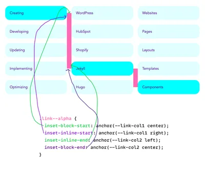
Next, we need to define the offset for our element by using the anchor function. We want our first line (the left pink rectangle) to start outside and in the middle of the first word element and to end outside and in the middle of the second word element.
.link--alpha {
  inset-block-start: anchor(--link-col1 center);
  inset-inline-start: anchor(--link-col1 right);
  inset-inline-end: anchor(--link-col2 left);
  inset-block-end: anchor(--link-col2 center);
}
I drew this crude diagram that follows to demonstrate how the placement of that pink rectangle works because it's totally fascinating to me!

It's the same setup for the second line, but we are the referencing the second and third word elements instead of the first and second.
.link--beta {
  inset-block-start: anchor(--link-col2 center);
  inset-inline-start: anchor(--link-col2 right);
  inset-inline-end: anchor(--link-col3 left);
  inset-block-end: anchor(--link-col3 center);
}
To make the lines, I am using a linear gradient in the following fashion:
- The first linear gradient is vertical line that is 100% in height and placed in the center of rectangle
- The second linear gradient is horizontal line that starts in the top left corner and is 50% of width
- The third linear gradient is horizontal line that starts in the bottom right corner and is 50% of width
.link {
  background-image: linear-gradient(to bottom, black, black), linear-gradient(to right, black, black), linear-gradient(to bottom, black, black);
  background-size: 2px, 50% 2px, 50% 2px;
  background-position: center, top left, bottom right;
  background-repeat: no-repeat;
}
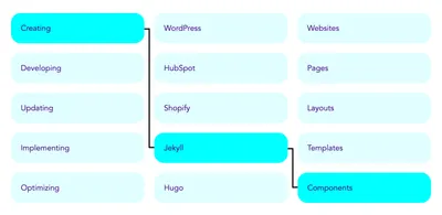
Here's how it looks now.

To generate different terms on each hover event and to automatically change the terms when no hover effects occur to make the whole component more appealing and inviting, we need to introduce a bit of JavaScript. Once the timeout expires, JavaScript will update the data-col1, data-col2, and data-col3 attributes.
const highlighter = (timeout = 4000) => {
  const $ul = document.querySelector('ul')

  const getRandomNumber = (min, max) => {
    return Math.floor(Math.random() * (max - min + 1)) + min;
  }

  const randomHighlighter = ($s, c) => {
    const nth1 = [1, 4, 7, 10, 13]
    const nth2 = [2, 5, 8, 11, 14]
    const nth3 = [3, 6, 9, 12, 15]

    let c1 = getRandomNumber(1, 5)
    let c2 = getRandomNumber(1, 5)
    let c3 = getRandomNumber(1, 5)

    if(c && nth1.indexOf(c) !== -1) {
      c1 = nth1.indexOf(c) + 1
    }

    if(c && nth2.indexOf(c) !== -1) {
      c2 = nth2.indexOf(c) + 1
    }

    if(c && nth3.indexOf(c) !== -1) {
      c3 = nth3.indexOf(c) + 1
    }

    if(c2 < c1) {
      document.body.classList.add('link-alpha-inverse')
    } else {
      document.body.classList.remove('link-alpha-inverse')
    }

    if(c3 < c2) {
      document.body.classList.add('link-beta-inverse')
    } else {
      document.body.classList.remove('link-beta-inverse')
    }

    $s.setAttribute('data-col1', c1)
    $s.setAttribute('data-col2', c2)
    $s.setAttribute('data-col3', c3)
  }

  if($ul) {
    const $lis = $ul.querySelectorAll('li')

    let hover = false;

    randomHighlighter($ul)

    const si = setInterval(() => {
      if(!hover) {
        randomHighlighter($ul)
      }
    }, timeout)

    $lis.forEach(($li, i) => {
      $li.addEventListener('mouseenter', () => {
        randomHighlighter($ul, i + 1)

        hover = true
      })

      $li.addEventListener('click', () => {
        randomHighlighter($ul, i + 1)

        hover = true
      })
    })

    $ul.addEventListener('mouseleave', () => {
      hover = false
    })
  }
}

highlighter()
There is one final problem that we need to resolve. In case when the second word is "higher" than the first word, the positioning will not work. That is because we cannot have "negative" elements, meaning the block end must be bigger or equal to block start property. To solve that problem, we will add another class to the body element.
// ...

if(c2 < c1) {
  document.body.classList.add('link-alpha-inverse')
} else {
  document.body.classList.remove('link-alpha-inverse')
}

if(c3 < c2) {
  document.body.classList.add('link-beta-inverse')
} else {
  document.body.classList.remove('link-beta-inverse')
}

// ...
Now we could adjust our line component's CSS and fix the background positioning, too.
.link-alpha-inverse .link--alpha {
  inset-block-end: anchor(--link-col1 center);
  inset-block-start: anchor(--link-col2 center);
  background-position: center, bottom left, top right;
}

.link-beta-inverse .link--beta {
  inset-block-end: anchor(--link-col2 center);
  inset-block-start: anchor(--link-col3 center);
  background-position: center, bottom left, top right;
}
Conclusion
The original solution to this kind of problems required a whole lot of JavaScript calculations and clumsy inserting of <style> element to our HTML. With CSS Anchor Positioning, we use JavaScript only to update our data attributes and toggle body classes -- all calculations and heavy lifting are done by our browser. I think that is wild and I cannot wait to see other useful places where this could be used.
Final Demo
Remember to see the lines, at the time of publication, you need to be in Chrome Canary with the Experimental Web Features flag turned on. If you want to see more JavaScript calculation heavy fallback, see here.
If you're really into these ideas, definitely check out the web.dev article Tether elements to each other with CSS anchor positioning